4.9 GOOGLE RATING

 USA
USA  UK
UK Colour Harmony and Contrast in Signage

There are many design elements that contribute to effective signage, ranging from typography to the choice of a colour scheme. Among these important elements, it’s also worth highlighting colour harmony and contrast, which can help create high-impact signs.
In this article, we look at the principles behind colour harmony and contrast and offer some guidelines for creating visually appealing signage through these important elements in colour theory.
Using the Colour Wheel to Create Colour Harmony & Contrast
Colour harmony helps create visually appealing signage, and contrast between colours ensures that a sign stands out. These two principles are key when it comes to attracting attention and eliciting a positive response from viewers.
The colour wheel offers an easy-to-understand guideline for mastering colour harmony and contrast. Here are some key concepts to know about the colour wheel:
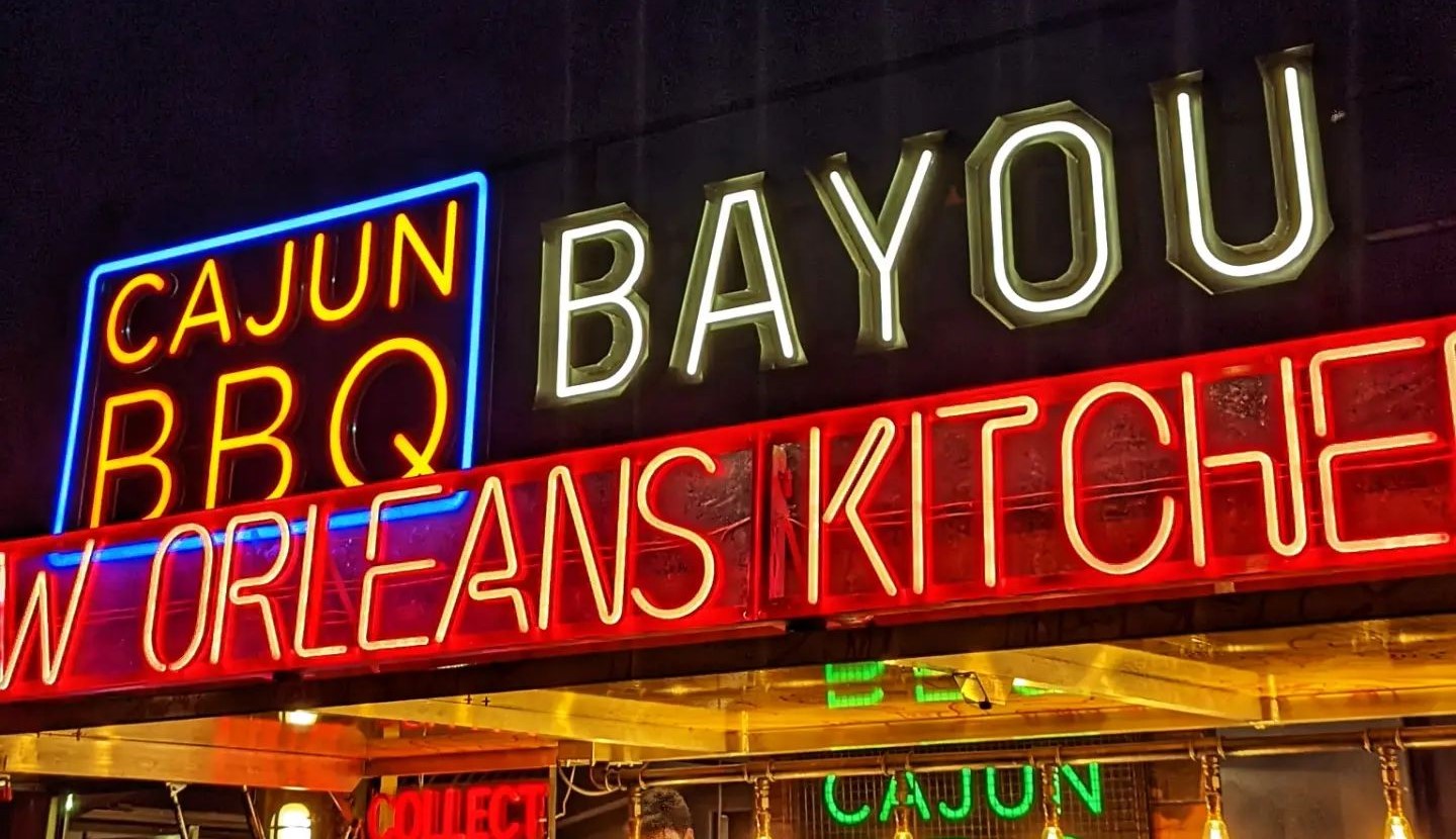
- Complementary colours are those located opposite each other on the wheel, such as reds and greens or blues and oranges. Complementary colour combinations are naturally high in contrast and make a strong first impression.
- Analogous colours are hues located next to each other on the wheel, which means they have low contrast (for example, yellow, orange, and reddish-orange). However, analogous colour combinations transmit coherence, so they’re ideal for conveying a unified message in signage.
- Triadic colours are combinations of three colours located at an equal distance from each other in the colour wheel (for example, blue, yellow, and red or purple, green, and orange). These colour schemes are good for designing signage that transmits high energy and vibrancy.

You can experiment with different colour harmony and contrast combinations for your commercial sign using this colour wheel.
Applying Colour & Visual Merchandising to Commercial Signage
Combining colour theory and visual merchandising can be applied to signage design to create signs that get all eyes on them. In retail and commercial spaces, the skilled combination of colour and visual merchandising can create captivating signage that has a positive impact on sales. There are five basic ways of integrating colour harmoniously with visual merchandising principles:
- Hierarchy Colour choice in signage can help establish a clear visual hierarchy that guides people’s eyes to the most important elements of a sign. For example, a sign with bold complementary colours placed against a muted background appears as more important or having a higher hierarchy than other signs.
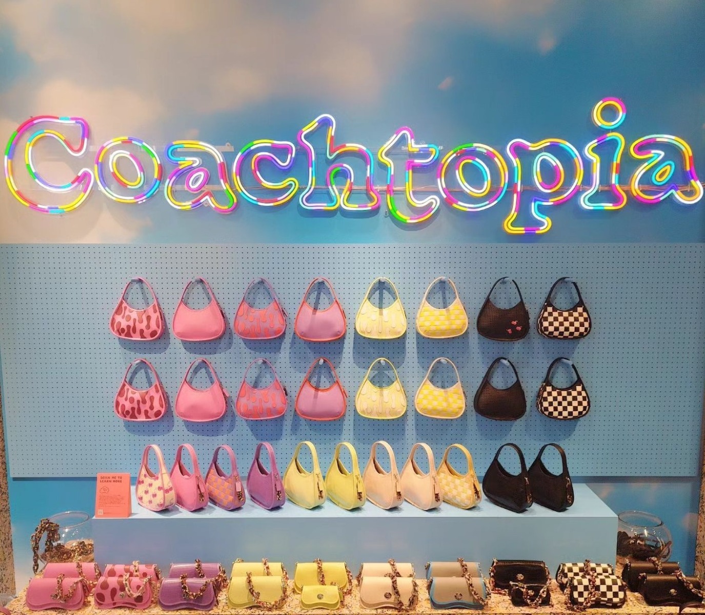
- Dynamic displays To create an immersive and interactive experience that delights customers, consider colour-changing LED neon signs that respond to user interactions.
- Point-of-purchase displays If you’re a retailer, you can place a neon sign with a triadic colour scheme in the point-of-purchase area, drawing attention to featured products or special promotions.
- Boosting sales with signage Signs with complementary colour schemes create a sense of visual synergy that encourages customers to explore, so they’re ideal for highlighting product bundles, complementary items, or any cross-selling or upselling opportunities.
- Facilitating wayfinding Directional signage with distinct colour schemes can guide customers through a store layout, or can be used at events like weddings or trade shows to highlight specific areas.


By incorporating these principles of visual merchandising into your signage design, you can transform static displays into dynamic experiences that captivate, engage, and inspire action.
Guidelines for Effective Signage Design
Next, we look at some practical guidelines to effectively implement colour harmony and contrast in your signage:
- Find out what appeals to your audience Not all colours resonate with everyone equally, so it’s worth researching the colour preferences of your target audience and then tailoring the sign’s colour scheme accordingly. Here’s some additional information on the colour preferences of different demographics.
- Aim for balance In signage design, more isn’t always better, as an overabundance of bold colours can overwhelm the senses. Aim for a balance between bold and neutral tones within the sign and between the sign and the surrounding area.
- Ensure legibility You can get very creative with custom LED neon signs, but you should always ensure that text can be easily read. This isn’t just a matter of font choice. For example, dark text on a light background or vice versa are good choices for optimal readability.
- Consider external factors Assess the area where your signage will be displayed, especially if outdoors, since changing lighting conditions can affect the visibility of a sign.

Conclusion
Understanding the psychology behind colour choices and the role of harmony and contrast is important when creating effective signage. These choices are more than just aesthetic factors; they can capture attention and transmit messages that resonate with customers. For personalized advice on how to build these principles into your business signage, get in touch with the Custom Neon team.
To find out more about our research or request an interview:
Get in touch with our Media & Outreach team now by contacting

Clare Jones
Global Outreach Manager
Email: clare@customneon.com
LinkedIn: Clare Jones
All product names, logos, and brands are the property of their respective owners. All company, product, and service names used in this website are for identification purposes only.
More research commissioned or undertaken by Custom Neon® can be found by clicking the following links: