4.9 GOOGLE RATING

 USA
USA  UK
UK Case Studies: Successful Brand Colour Strategies
Effective signage is a powerful tool for businesses looking to establish their presence in a competitive landscape. One key element contributing to the effectiveness of a sign is the use of colour.
Across several industries, companies have leveraged smart colour strategies to create impactful signage that resonates with their audience. In this article, we examine four case studies of businesses that have successfully used colour in their signage to boost brand recognition and sales.

Case Study 1: McDonald's
The world's leading fast-food chain has succeeded when using colour in signage to shape the customer experience and brand perception. Changes to their signage strategy show how colour can be used to adapt to changing customer expectations.
Colour Strategy
- Red and yellow combo McDonald's trademark yellow and red colour combination was chosen for its effect of stimulating appetite and creating a sense of urgency that draws customers in.
- Switch to green in Europe In a bold move, McDonald's introduced green signage in Europe to modify brand perceptions towards a more environmentally friendly ideal. Green conveys concepts like freshness, health, and sustainability, which are key consumer preferences in many European markets.
Results
- Environmental consciousness McDonald's adoption of green signage in Europe showcases the company's dedication to sustainability and has helped position the company as a more upmarket choice than its competitors.
- Notable sales increases European sales increased by 15% during the first six months after the introduction of green signage.

Case Study 2: Coca-Cola
Few brands are as iconic and instantly recognizable as Coca-Cola. The company’s use of colour in signage has been instrumental in establishing its vibrant brand identity and in capturing customers’ attention.
Colour Strategy
- Dominance of red Coca-Cola's traditional signage prominently features the colour red, chosen to evoke feelings of energy and excitement, which are instantly associated with the beverage.
- Red in visual merchandising In Russian stores, Coca-Cola used digital shelf technology with red LED panels. The combination of red colour with digital technology created a visually striking display that increased product visibility.
- No room for doubt The use of white text against a red background enhances legibility and ensures that the brand message is unmistakable.
Results
- Increased brand recall Coca-Cola's consistent use of red in signage has positioned the company as a global icon synonymous with enjoyable moments and positive emotions.
- Boost in sales and visibility The use of red in digital shelf technology in Russian stores was found to increase shopper’s attention and sales from 35% to 67%.
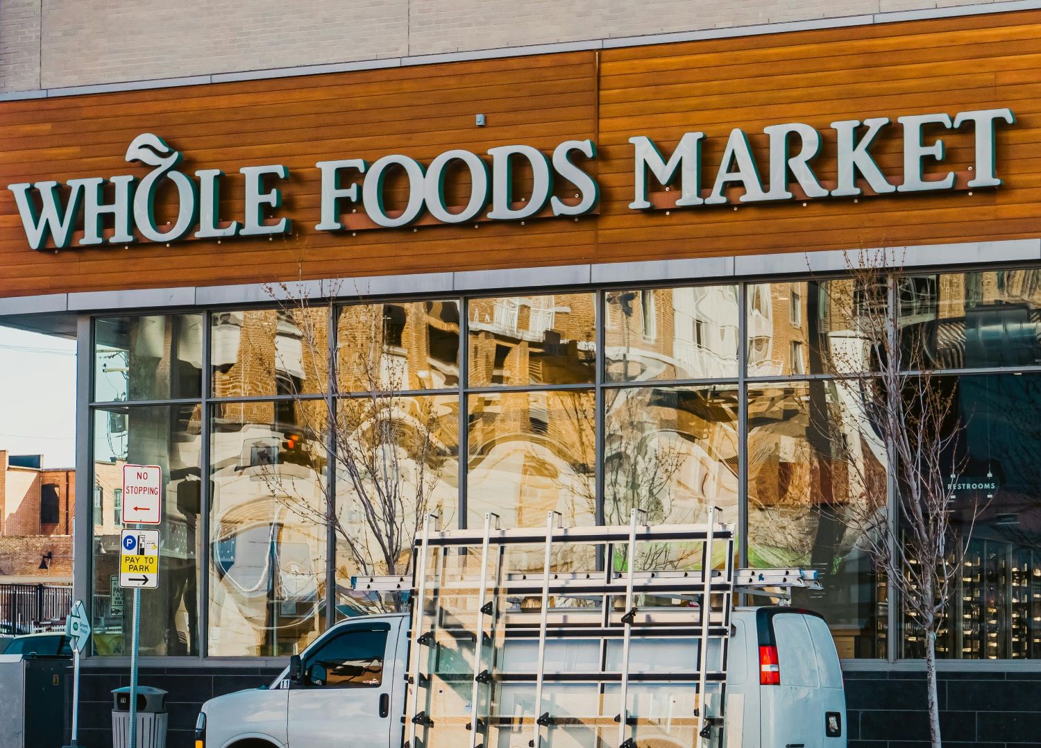
Case Study 3: Whole Foods Market
This renowned grocery chain has more than 500 stores across North America and the United Kingdom. Some of these stores, like the one in Columbus Circle (New York City), experience very high foot traffic levels. Let’s see how the company used the power of colour psychology in signage design to create a better in-store experience.
Colour Strategy
- Contrast in signage Whole Foods employs high-contrast colour combinations in their directional signage, using black text over white backgrounds and vice versa for easy readability.
- Colour-coded wayfinding Store check-out areas are marked with different colours based on the number of items shoppers have in their carts, which helps streamline queues and reduce waiting times.
- Brand consistency In-store signage relies on clean and natural tones, such as green and earthy colours, to reinforce brand identity and create a sense of familiarity among shoppers.
Results
- Increased foot traffic Changes to directional signage at the Columbus Circle store resulted in record-high sales.
- Enhanced wayfinding Colour-coded signage simplifies the shopping experience, allowing customers to locate specific products and departments easily.
- Improved brand perception The consistent use of colour contributes to a visually appealing environment, which reinforces Whole Foods' reputation as a trusted brand for quality groceries.
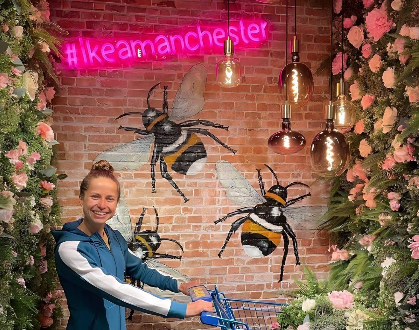
Case Study 4: IKEA
The famous Swedish furniture retailer is known for effectively using signage to deliver an enjoyable shopping experience and for guiding customers through the store’s vast showroom layouts.
Colour Strategy
- Blue and yellow branding IKEA's signage prominently features blue and yellow. By appealing to the brand's Scandinavian heritage, these complementary colours reinforce positive associations with quality and innovation.
- The power of hashtags IKEA stores in England use LED neon signs with relevant hashtags to encourage shopper-generated content and as a highlight to their Instagram-ready displays.
- Less is more Directional signs mostly consist of graphics and symbols, avoiding unnecessary words and therefore ensuring that signage is easily understood and discovered in a large and potentially distracting showroom environment.
Results
- Pleasant experience IKEA's simple signage streamlines customers' shopping experience, reducing the confusion and frustration often associated with navigating large retail spaces.
- Customer engagement By strategically using colour in their signage, IKEA creates an immersive environment that encourages exploration and discovery, which are key to retail dwell time and higher sales.
Conclusion
These case studies illustrate the profound impact that colour can have on signage design and brand perception. There are many other ways to use colour to create compelling signage, both in indoor and outdoor settings. To find out which strategy will work best for your business contact the Custom Neon team.

65,000+
HAPPY CUSTOMERS

ENGINEERED FOR
COMMERCIAL USE

CUSTOM-BUILT
TO YOUR SPECS

FREE
SHIPPING

UNLIMITED
DESIGN REVISIONS

3 YEAR
WARRANTY
To find out more about our research or request an interview:
Get in touch with our Media & Outreach team now by contacting
Clare Jones
Global Outreach Manager
Email: clare@customneon.com
LinkedIn: Clare Jones
All product names, logos, and brands are the property of their respective owners. All company, product, and service names used in this website are for identification purposes only.
More research commissioned or undertaken by Custom Neon® can be found by clicking the following links: